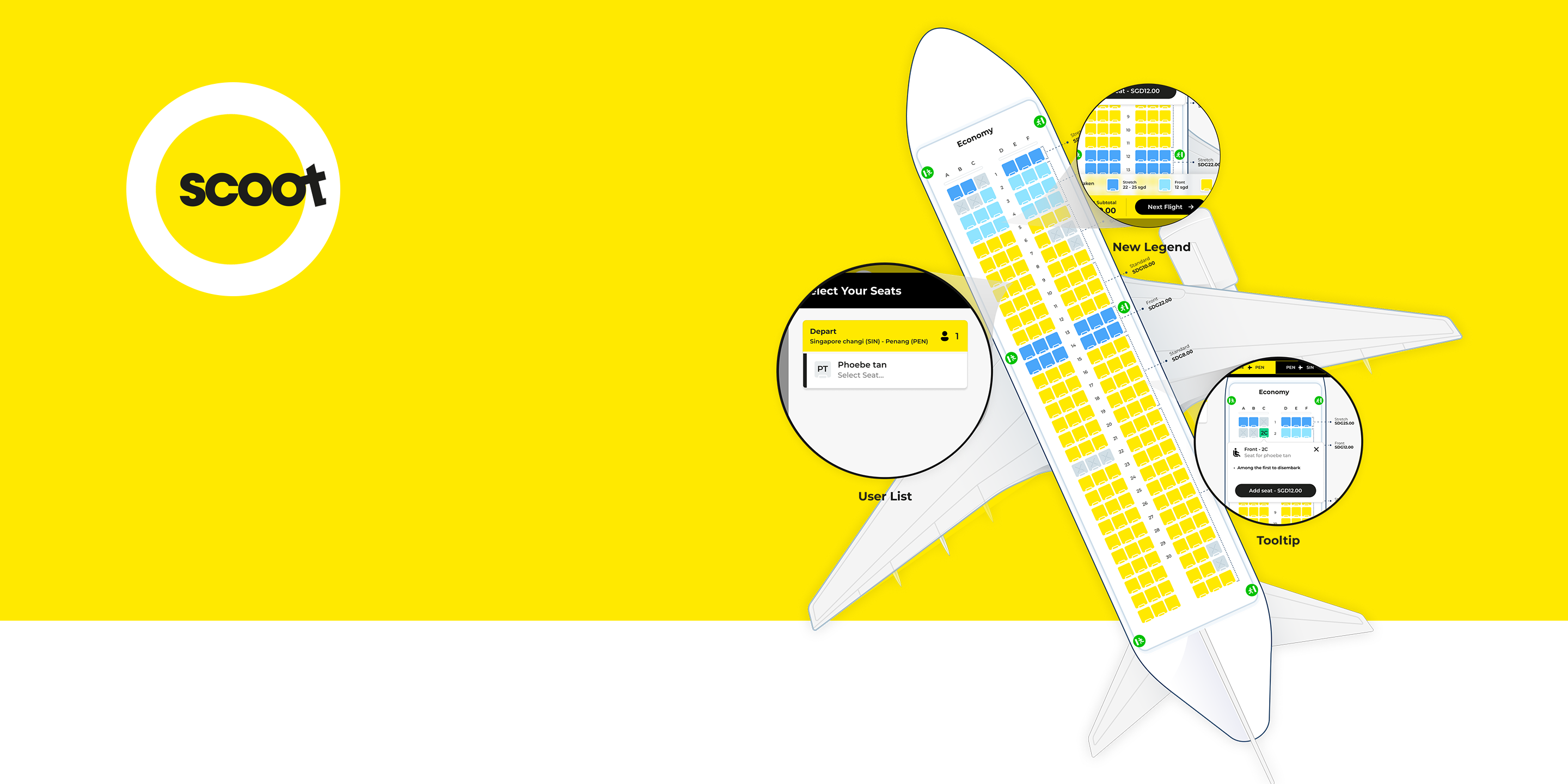
Seat Selection Redesign
UI UX Design
Oct 2024 - 2days

Create a seat selection feature for Scoot's website or app that provides users with a visual representation of the aircraft layout and allows them to choose seats based on preferences and additional services. Design the interface to be intuitive, informative, and visually engaging.
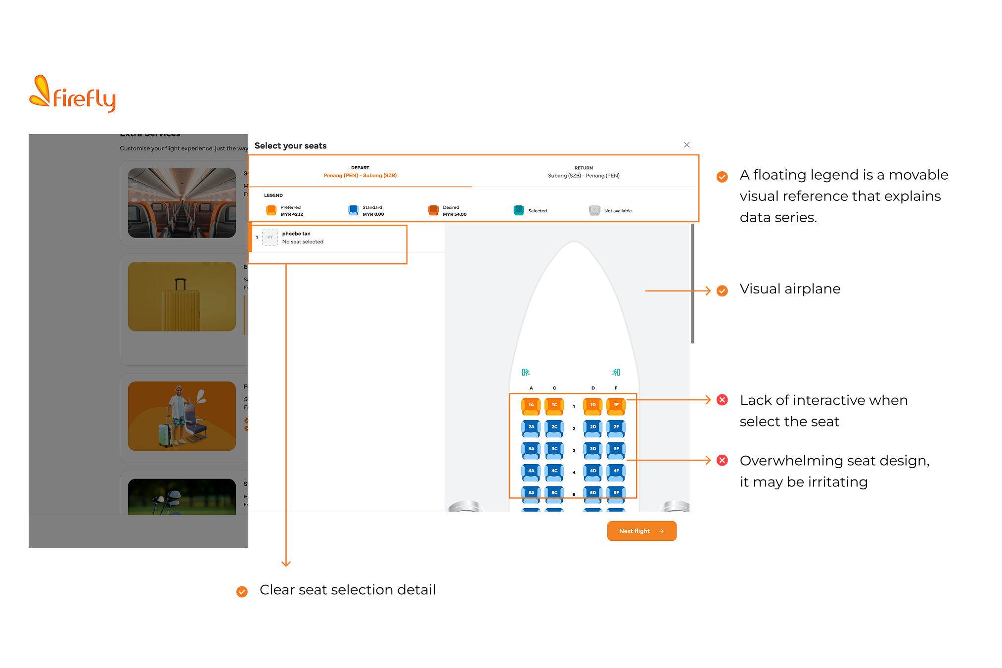
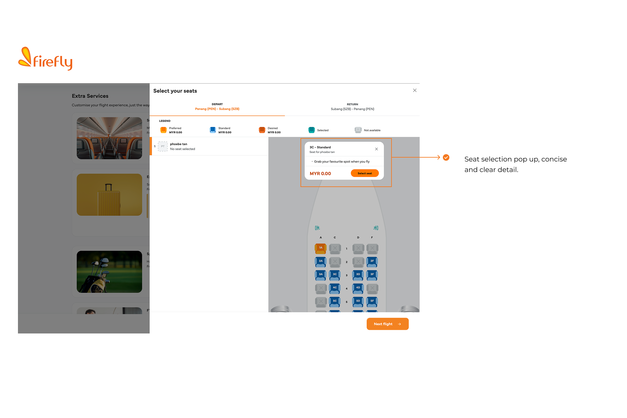
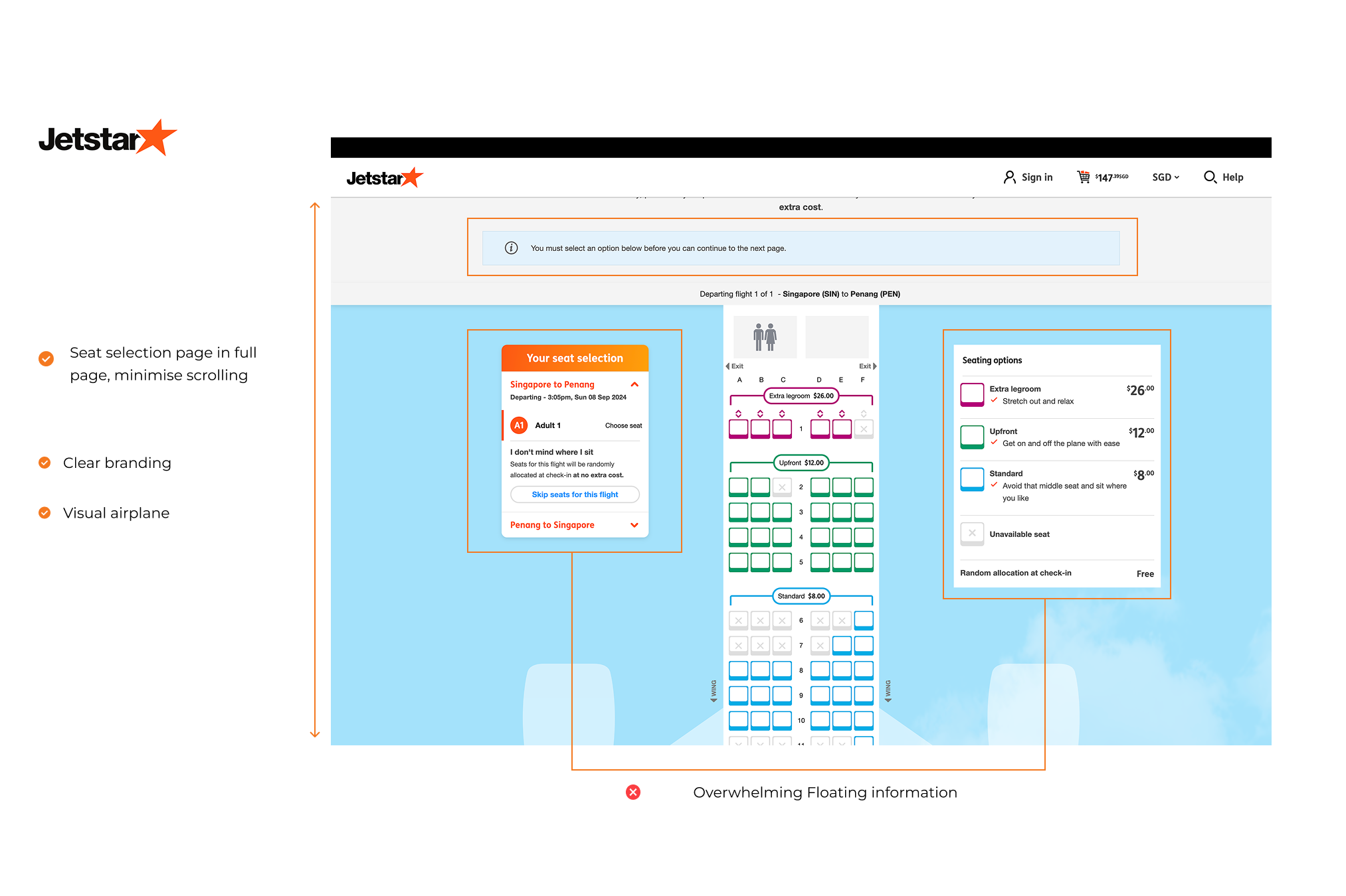
I analyzed the 3 direct competitors - Jetstar, Firefly, Airasia that have offerings that are similar to scoot and focus on the same audience. I evaluated the seat selection pages of various airline websites, focusing on first impressions, user interaction, visual design, and content clarity.
First Impressions - big screen, small screen
Interaction - Features, Accessibility, User Flow, Navigation
Visual - Brand Identity
Content - Tone, Descriptiveness


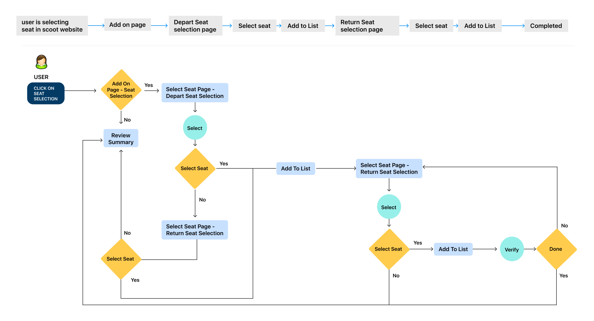
Analyze the current seat selection process at Scoot to identify key steps, user interactions, and potential areas for improvement. This includes mapping out the flow, reviewing the user interface, assessing pain points, and comparing with industry standards to ensure a seamless and user-friendly experience.

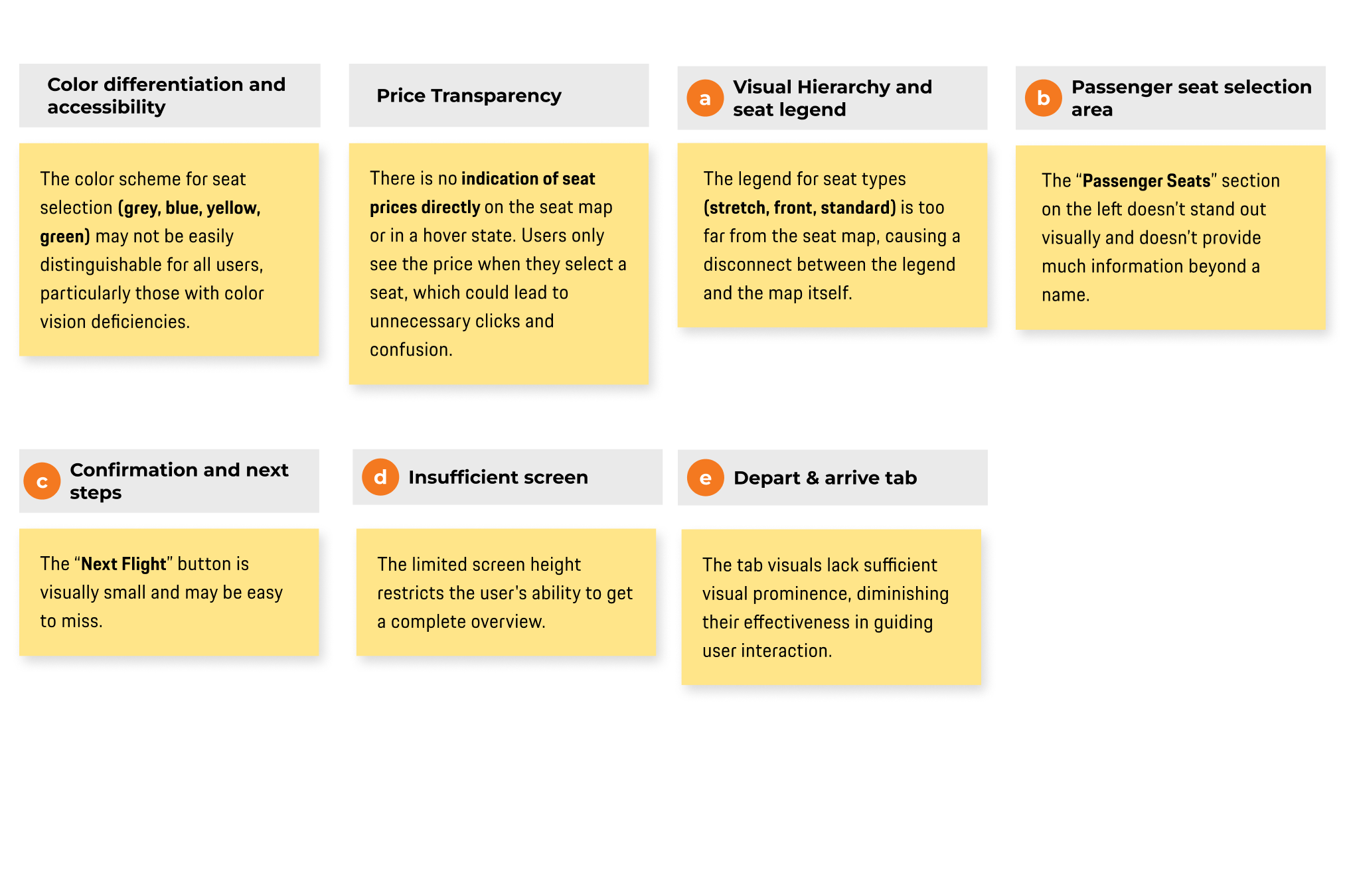


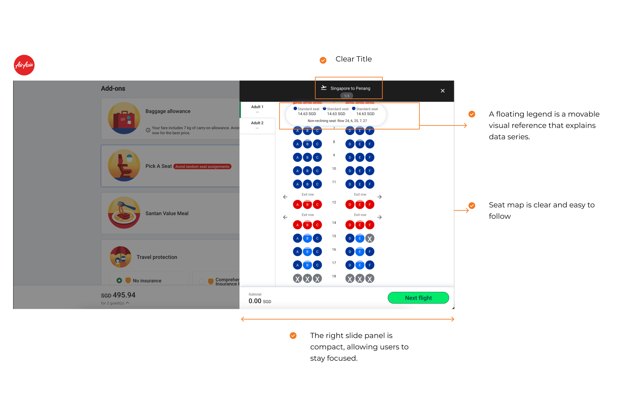
1 - Header
Minimised the high of the tab
toggle between flight legs (SIN ➔ PEN, PEN ➔ SIN) is added. making it easy for users to manage seat selection for multiple flight segments without having to navigate away from the current screen.
2 - Body
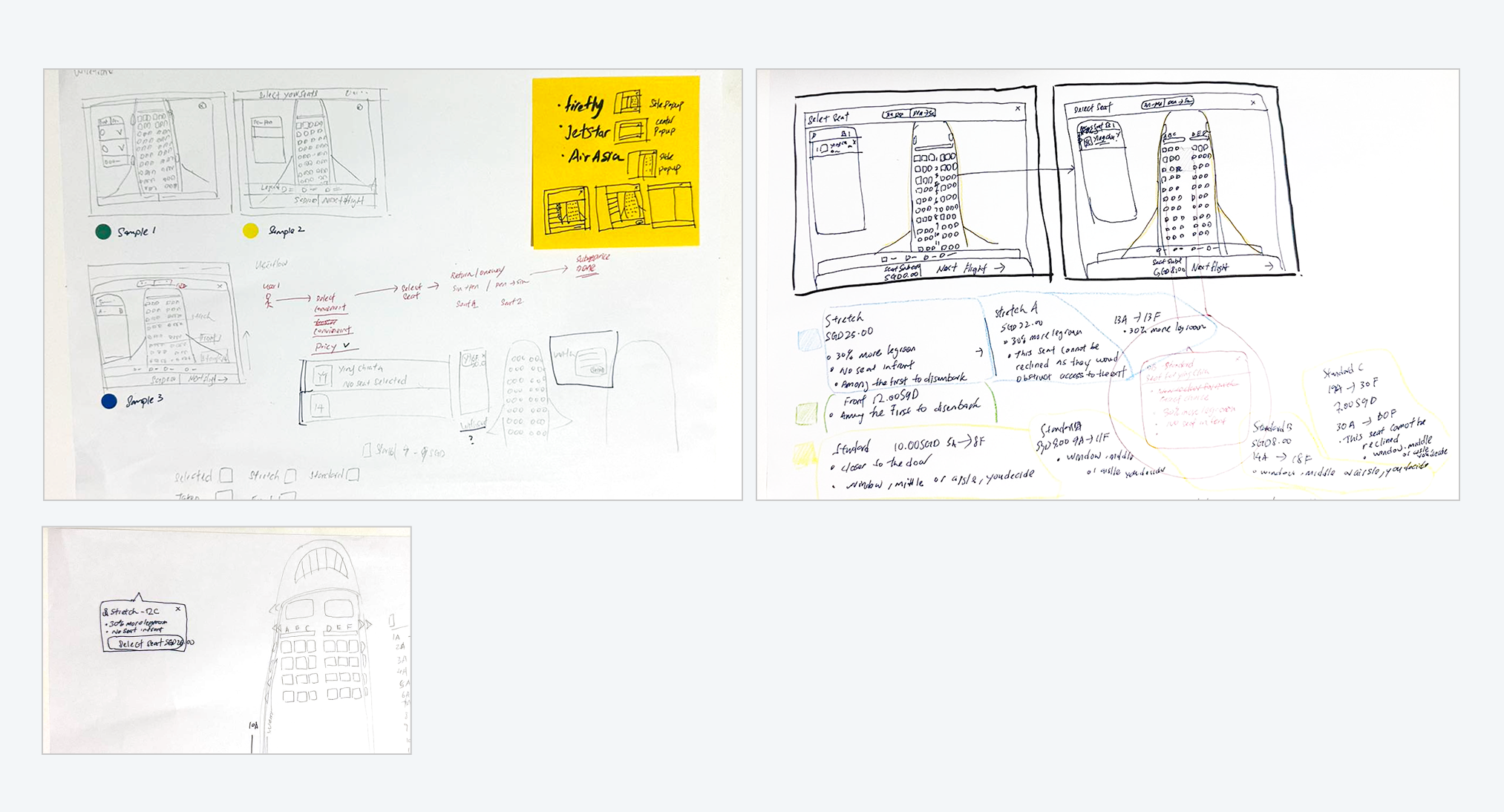
Pricing Indication
The price for each seat type (Stretch, Front, Standard) is now clearly labeled beside the seat map, along with a color-coded system to indicate pricing tiers.
Users can quickly see the seat prices, making it easier to compare different seat options and understand their choices without needing to click or explore further.
Visual Hierarchy
The price for each seat type (Stretch, Front, Standard) is now clearly labeled beside the seat map, along with a color-coded system to indicate pricing tiers.
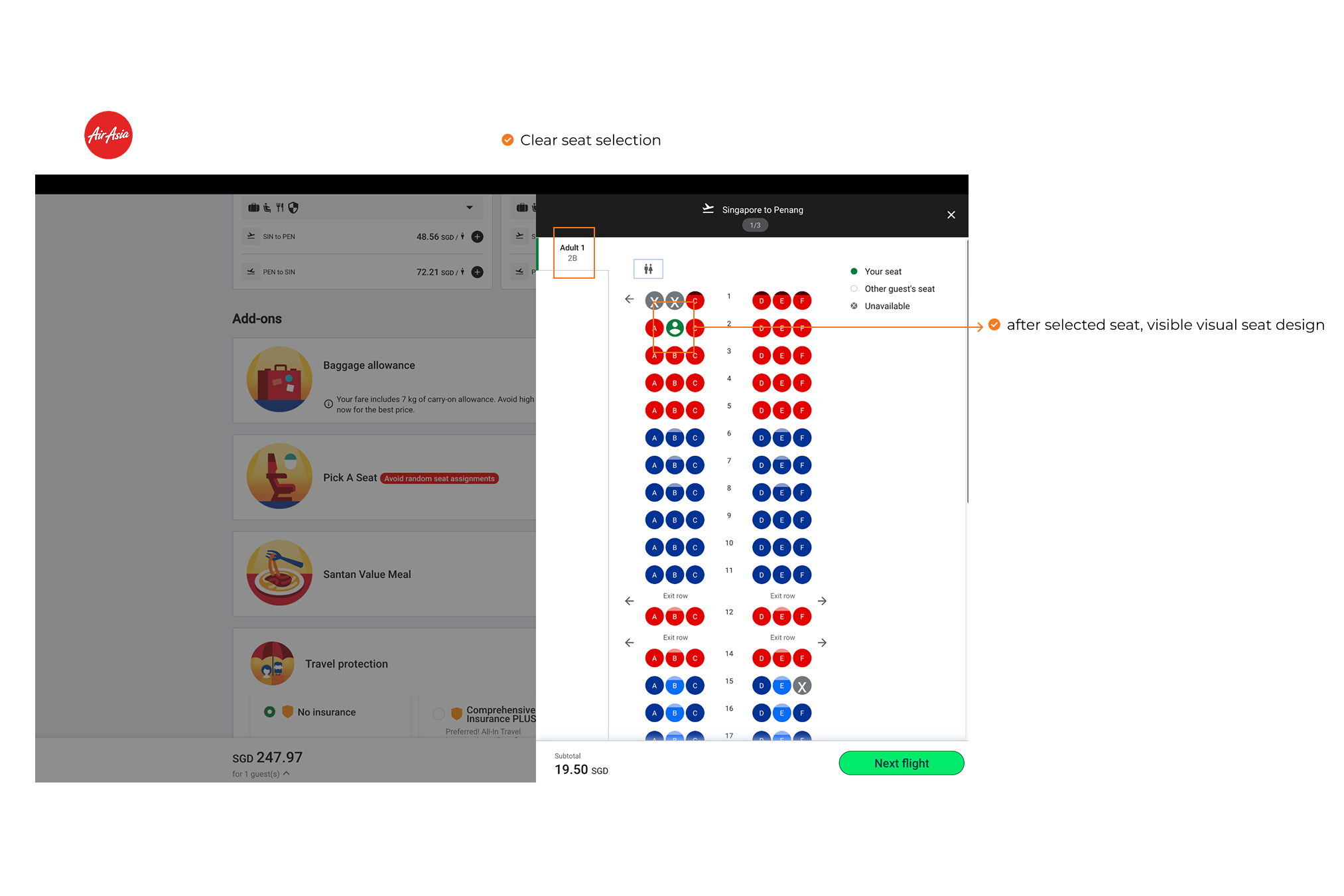
Seat Information Tooltip
The new design prominently displays a tooltip that provides essential “add seat button”, simplified the CTA text.
Seat Status Icons
The use of icons for selected and taken seats (shown at the bottom) enhances the legend's usability, providing visual cues to differentiate between selected, available, and unavailable seats.
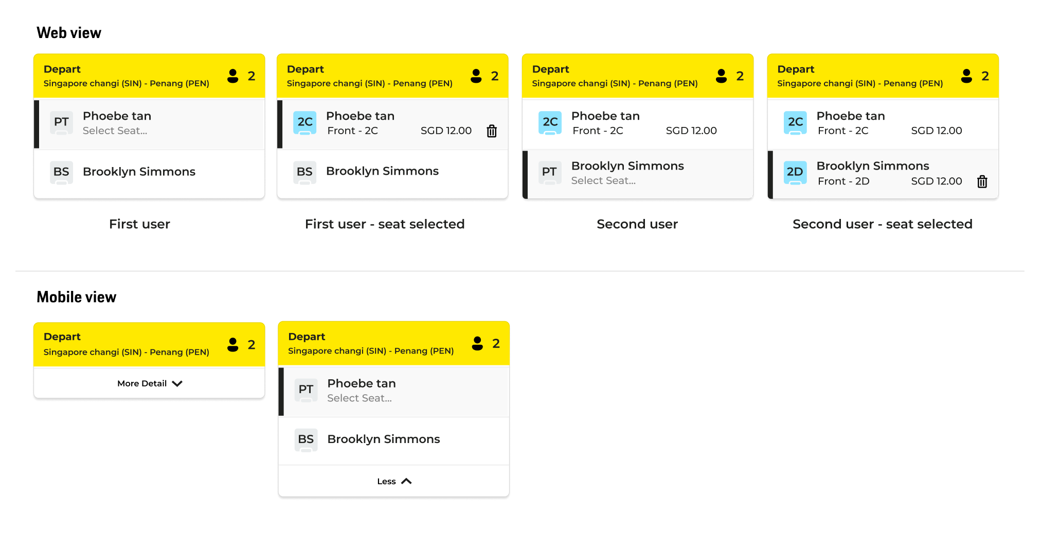
User list
User list prominently displayed, clear current status and detail is added.
Total customer is added and simplified with added icon.
Clear customer detail list
3 - Subtotal Price / Main CTA
The "Next Flight" button and subtotal price is highly visible into center with a strong contrast, guiding users to the next step